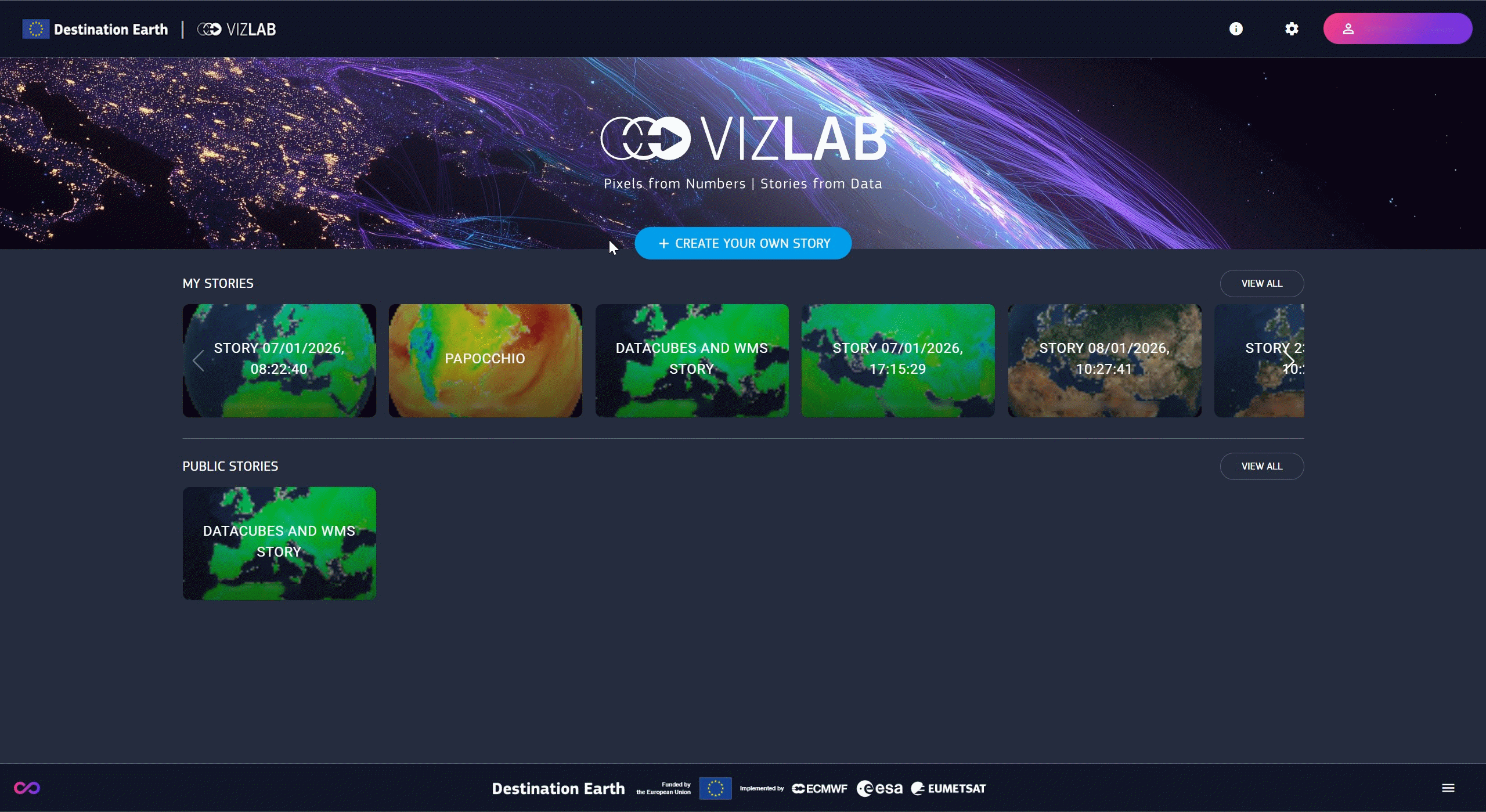
Home is the landing page of the platform. The startup screen provides a quick overview of published and private stories (if registered).
Before getting into stories, this chapter focuses on data and how data take the form of interactive layers. Stories and slides are discussed in “Stories”.
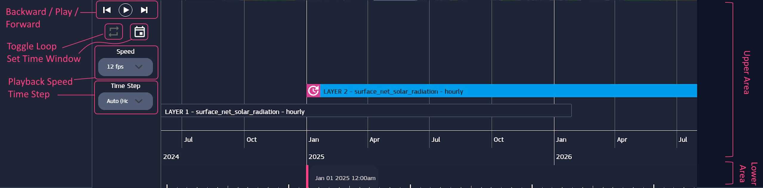
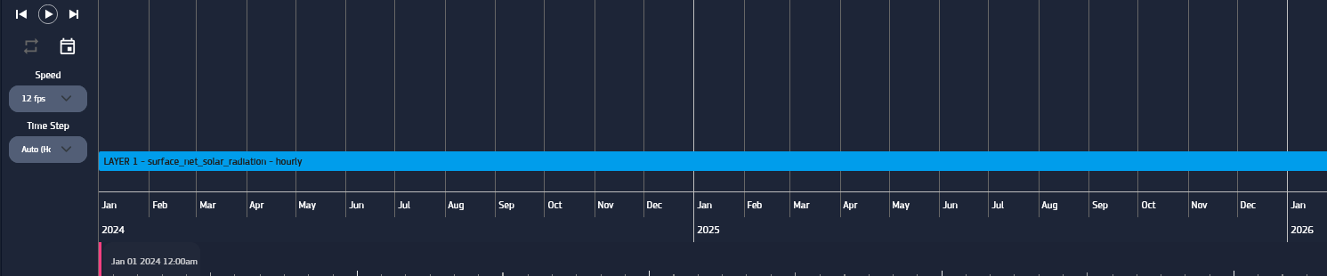
Timeline can be navigated back and forth by dragging inside the upper area.
The bar in the lower area marks the selected time instant, which can be changed by clicking on the area or dragging the bar.
Zoom the size of time interval displayed in the timeline, can be achieved with the mouse wheel while hovering on the lower area.
Set Time Window displays a panel to set the start and end date of the timeline view.
The timeline also acts as a player for layers, allowing to play them using the Play, Step Backward, and Step Forward buttons.
When stepping backward or forward, the timeline moves to the previous or next instant according to the defined Time Step.
It’s also possible to adjust the Playback Speed as needed, and Loop the playback.
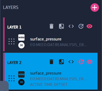
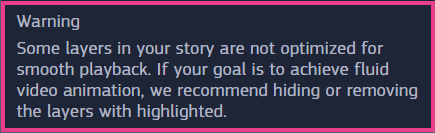
Note : some layers may not be optimized for playback, which can affect how smoothly they are played.
The presence of unoptimized layers is warned at the bottom of the layers panel, and they are marked with a magenta stripe on their left side.
For maximum speed, it’s recommended to hide or remove them before playing the timeline, if possible.
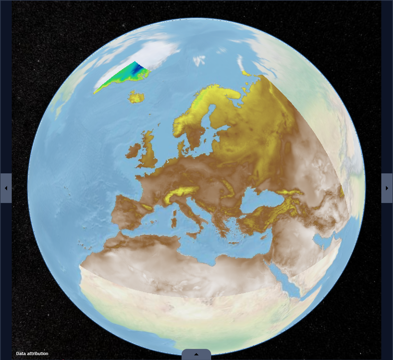
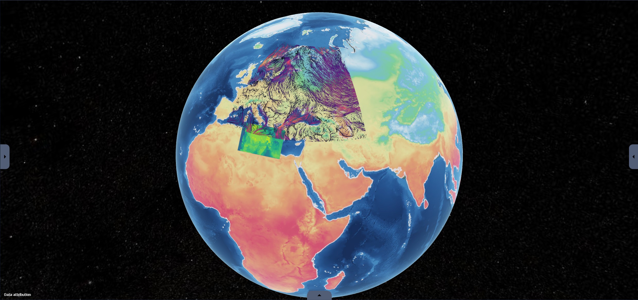
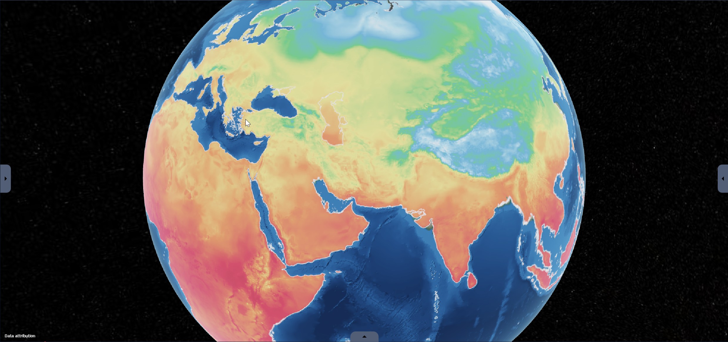
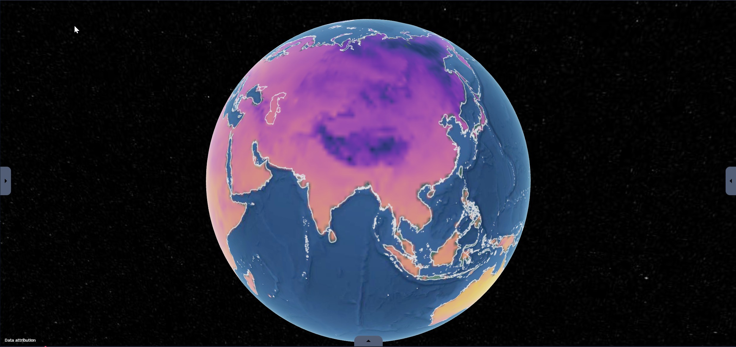
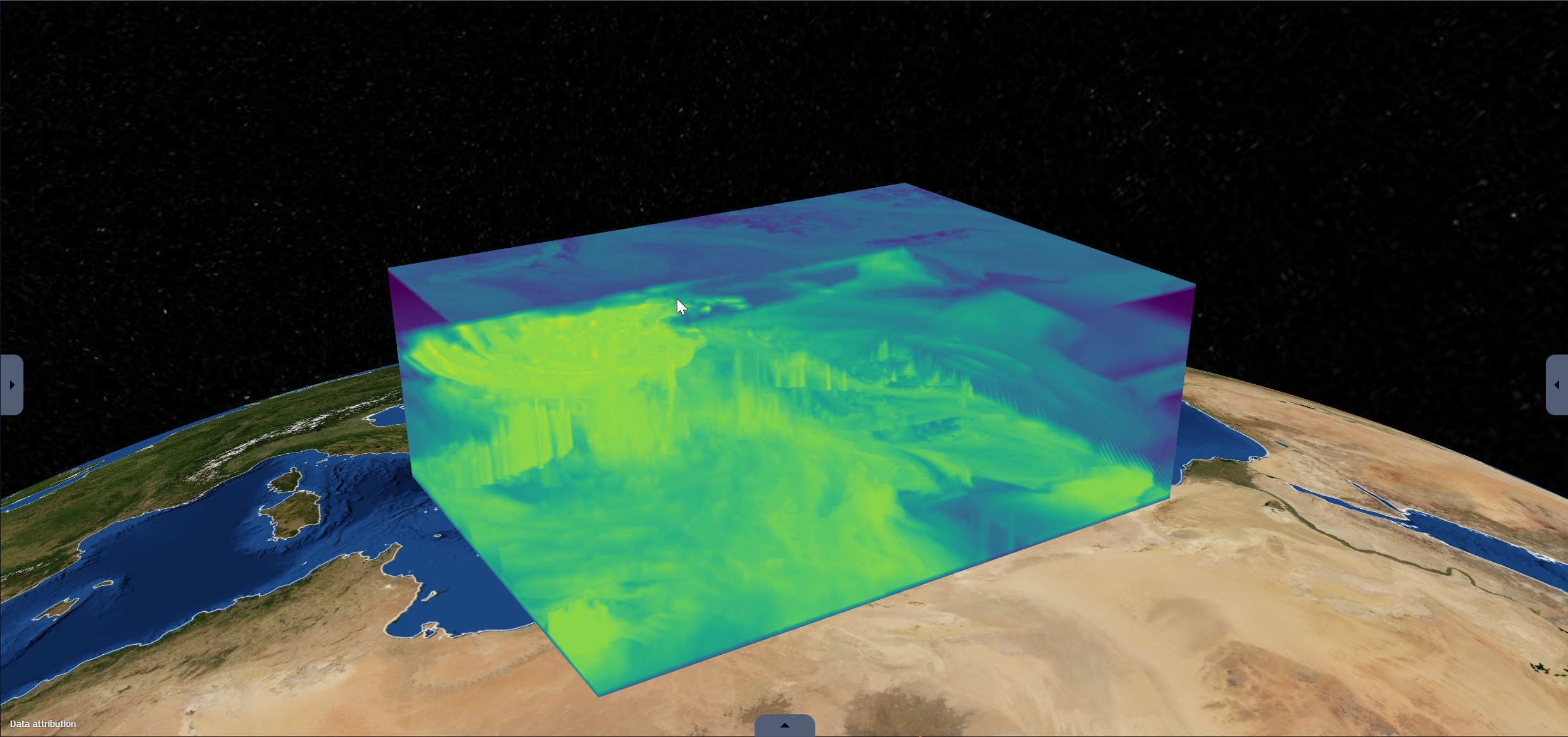
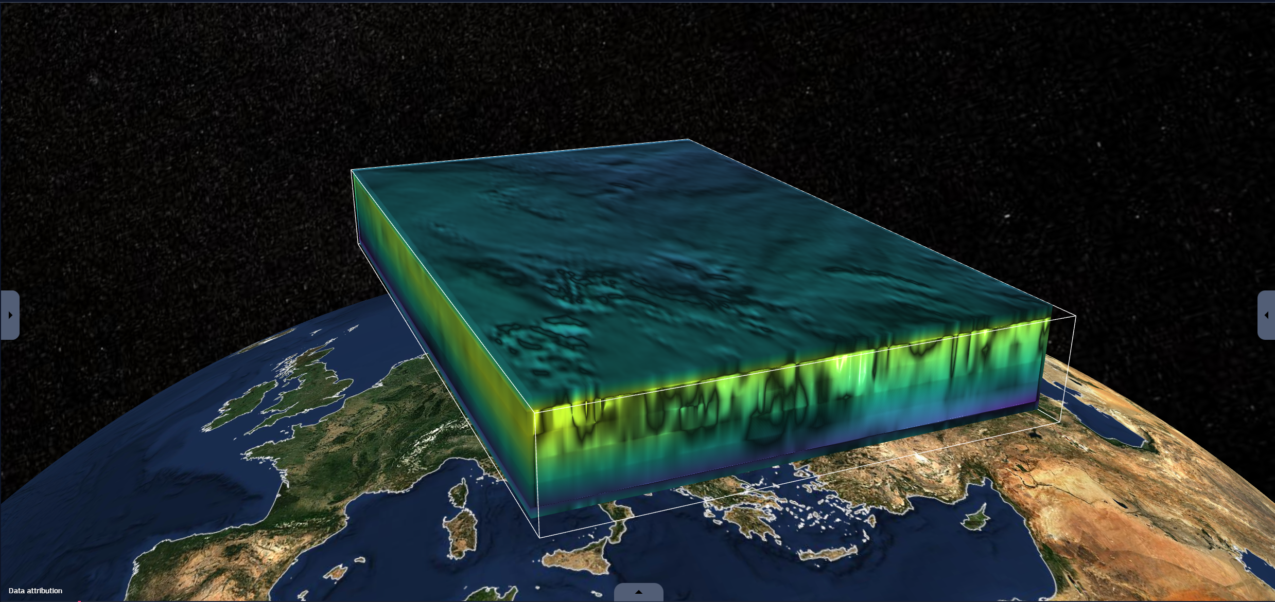
Layers visually represent data on the Earth at the corresponding time and location.
Fig. 2.7 Viewer with one map, one stream and one volumetric layer
The creation of a layer is the result of transforming original data into a visible representation, therefore adding a layer requires some data to start from.
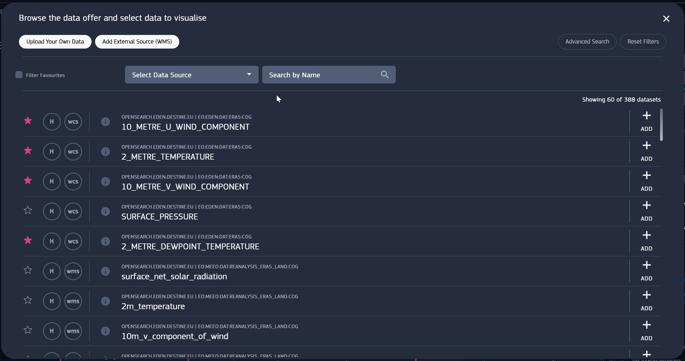
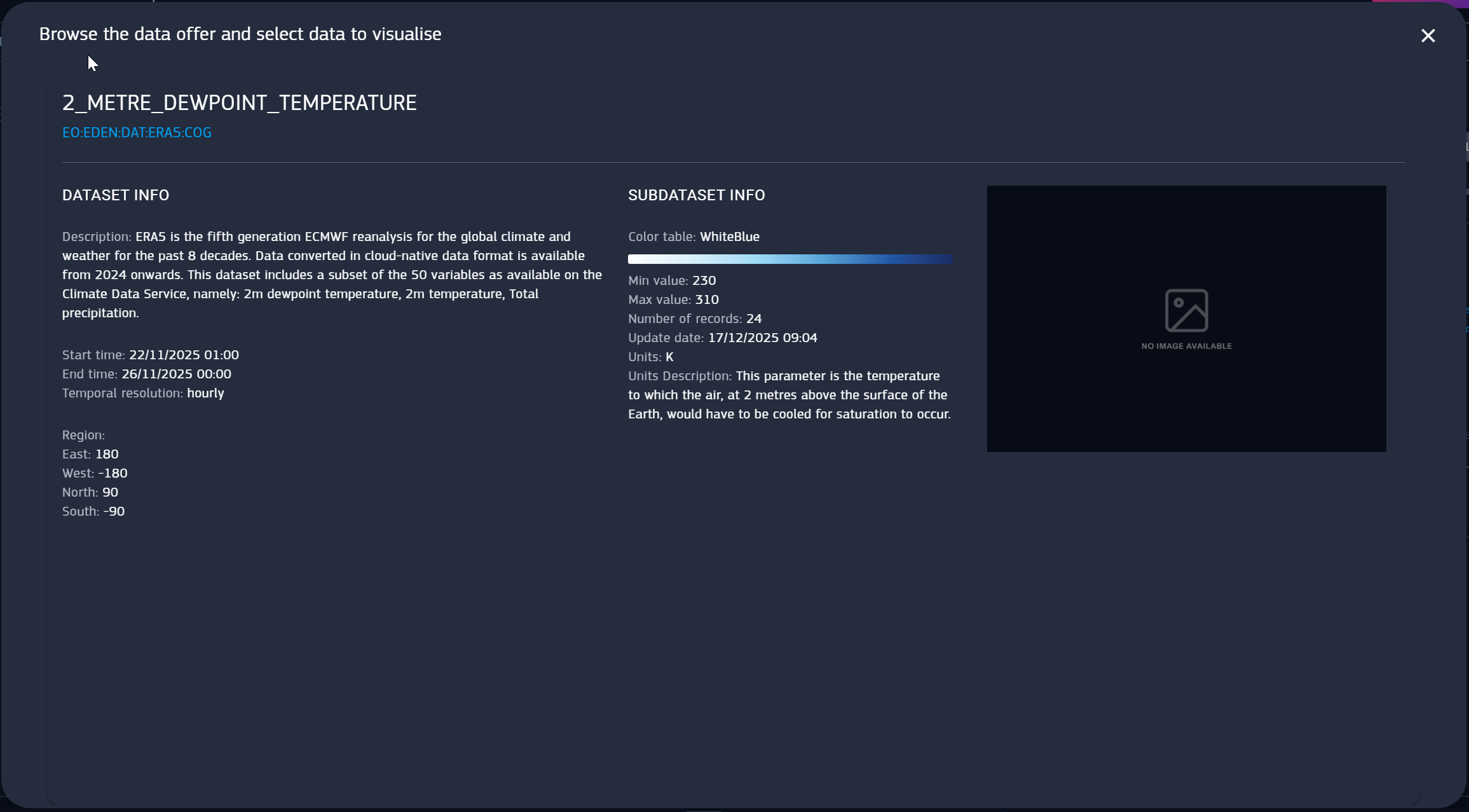
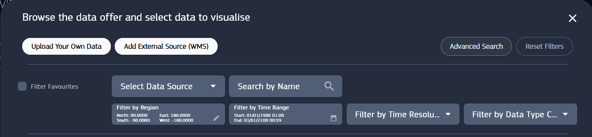
This is why the platform provides a way to explore datasets before using them, the Data Offer tool.
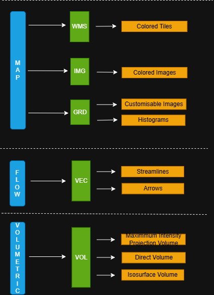
Datasets are categorized in data type categories. Each category groups different data types, and each data type can have multiple data visualization.
This hierarchy is is shown in the following scheme
Colored images visualization includes videos as well, because videos are treated as same layer type.
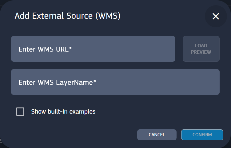
WMS can be also added with Add External Source (WMS), providing the URL of the external source.
Data Offer provides datasets from many different sources, but you can create your own datasets by uploading data from local storage (Upload your own data).
Data you upload appear in the data offer among the other sources. See chapter “Upload Your Own Data” for more information.
Datasets from any data source can be directly added as layers, with the exceptions of CACHE-B.
This source is notable because its data may be large and before usage are required to be extracted in smaller portions, called “data cubes”.
Selecting the visualization type doesn’t immediately add the layer but redirects to specific submenus to select existing data cubes or create new ones.
This topic is discussed in “DCMS Cache-B Data Access” chapter.
You can use filters for a quicker and easier browsing.
Data can be searched by name in the Search bar and filtered by parameters such as Data source, Visualization Type Category and Time Resolution.
Additionally you can Filter Favorites. You can add a dataset to favorite with the star button on its list card.
Data sources list include user uploaded data, under My Data.
Date Range filter is equipped with a calendar widget to set the start and the end date. Region filter delimits the rectangular area visible on the layer.
Vizlab provides a convenient way to manually select the region of interest with the Draw Region tool.
Draw Region is accessible from the Region filter in the Data Offer panel, or when creating a data cube. For data cube creation, please refer to “DCMS Cache-B Data Access” chapter.
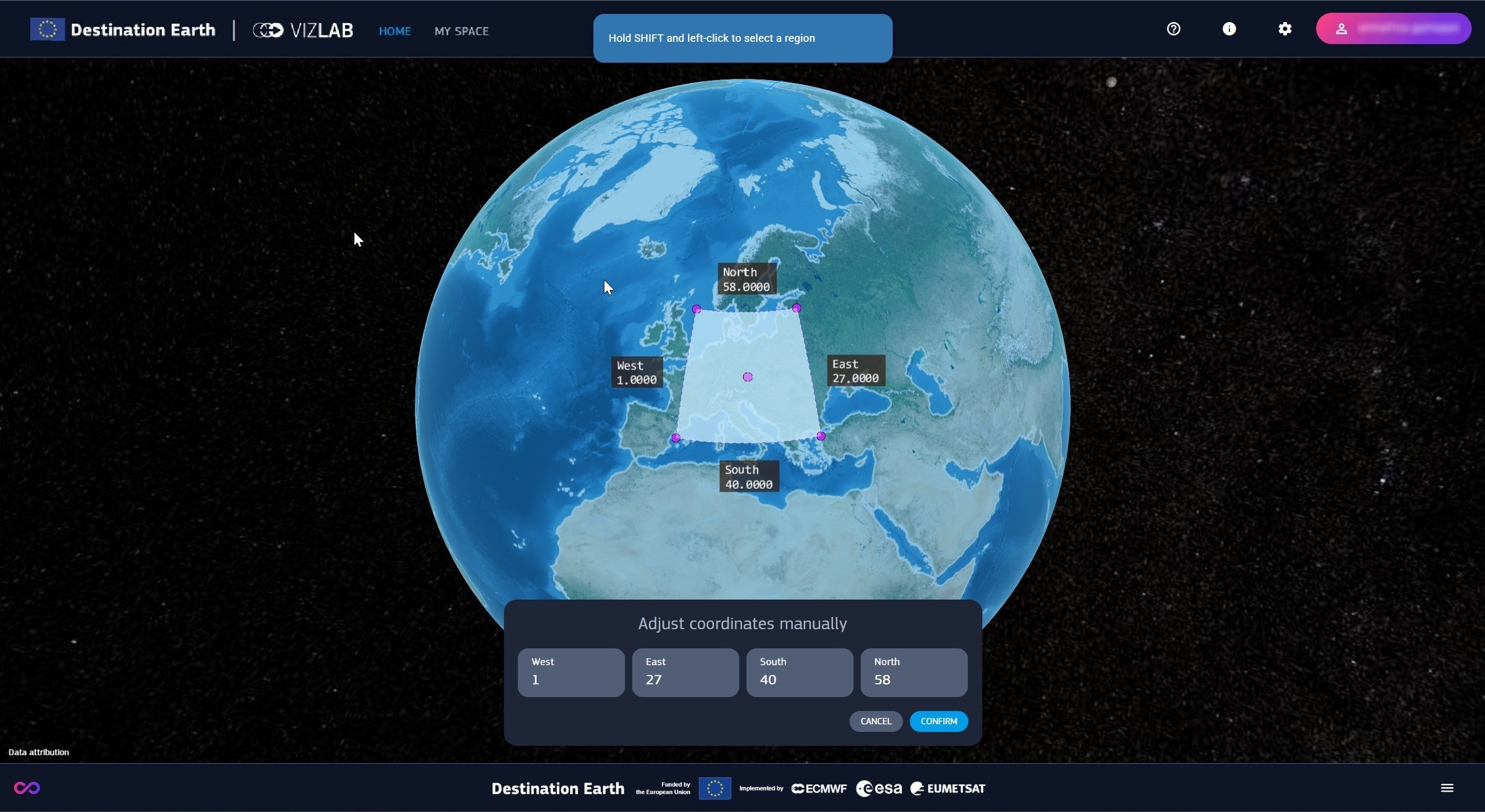
Opening the tool maximizes the viewer showing the gizmos to select the region :
A blue semitransparent rectangle covers the maximum available region
The region of interest is defined by a black and semitransparent rectangle and its coordinate labels
Region of interest can be adjusted using the magenta-bordered selector, equipped with draggable handles
The region of interest is initially set to the default extension of the original dataset, with the selector fitting its area.
Drag and drop selection, performed with the combination of SHIFT and pressed left button, can be done in three ways :
Starting drag without touching any handle draws the selector from the starting point to the end of drag point.
Dragging by one of corner handles allows for changing the selector size in place.
Dragging by the center handle moves the selector without changing its size.
The selector can be freely extended anywhere on the globe but any portion outside max region is ignored.
When not dragged, the selector always matches the area of the region of interest, even if empty (in that case the selector is hidden).
It cannot be dragged by the center outside the max ragion, but it snaps to its edges when reaching the boundaries.
Known limitations of this tool :
For volumetric dataset, the region of interest is capped (Check “Getting Started”)
Selection through the 180th meridian is not supported
Beside drag and drop selection, the area can be set up by typing the coordinates in the bottom panel.
Once done with the tool, the new values can be canceled or confirmed, provided the region is not empty.
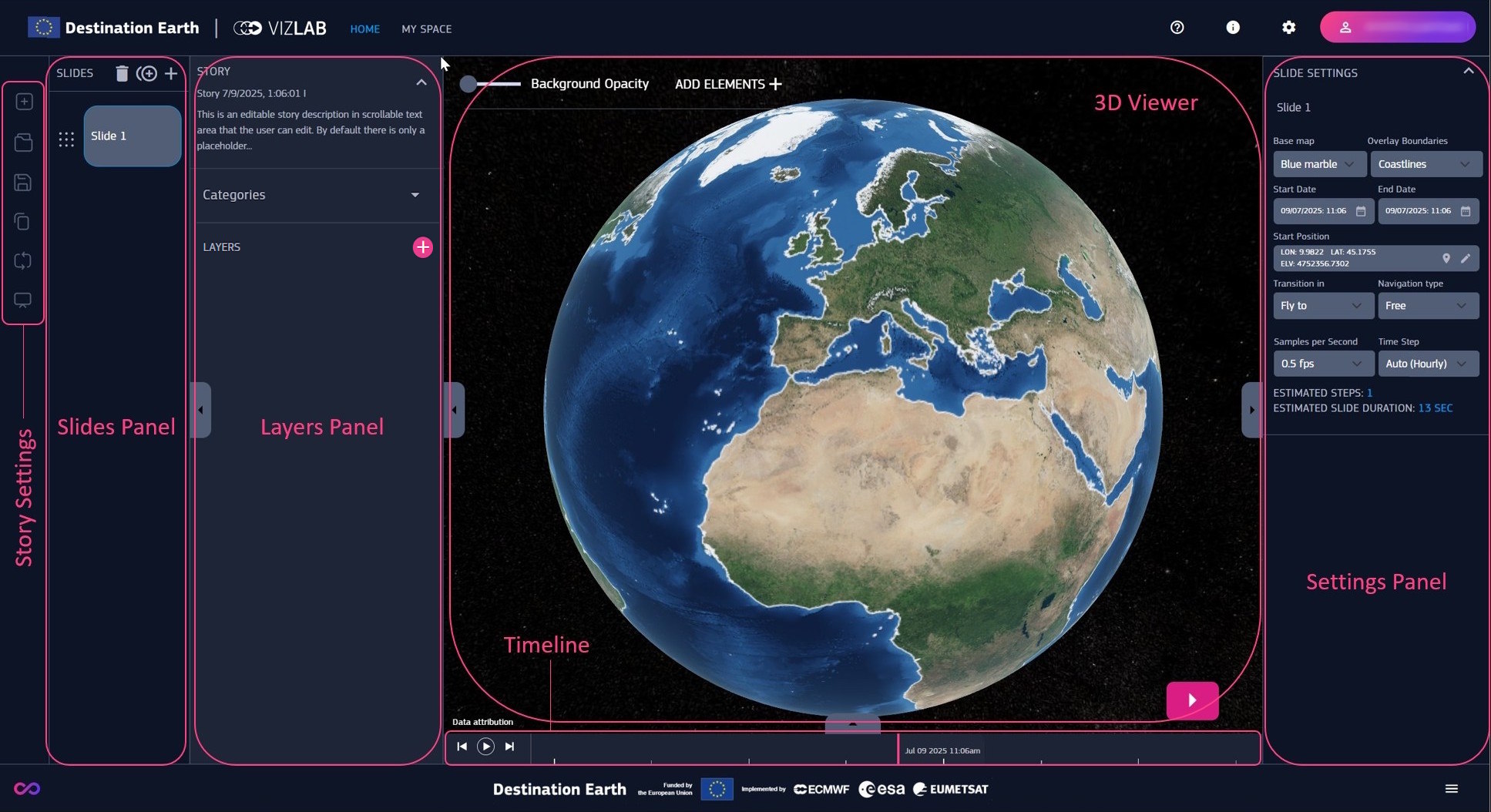
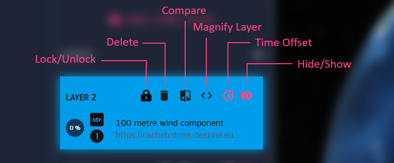
Once a layer is added, it’s visualization appears in the 3D view on the Earth model, and its card visible in the layers panel.
Layers can be renamed and reordered inside the list by grabbing them by the grid icon. Layers rendering order in the viewer follows their top-down ordering.
A layer card is equipped with buttons to manage the layer :
Magnify Layer matches the timeline view to the time interval of a layer. Upon magnification, the time bar is automatically placed at the start date of the layer.
If a layer doesn’t show up in the viewer, it may be due to the selected instant being out of interval, so magnifying might be needed.
If a layer uses a data cube, the additional Lock/Unlock button sets whether keeping a data cube in the personal storage.
This feature, is described in “My Space”, while data cubes in general in “DCMS Cache-B Data Access” chapter.
Compare, and Time offset are discussed in the next paragraph.
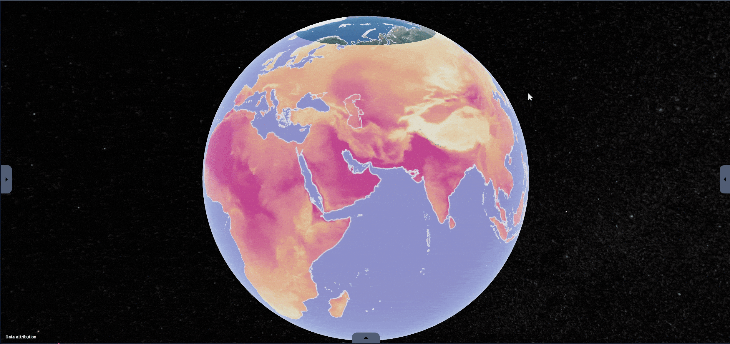
Compare mode is a useful feature for comparing different layers, which can help study changes of phenomena over time.
When this mode is enabled, the 3D view is split with a vertical line in two sides, that can be adjusted by dragging the line, layers partially rendered on one of the two sides.
Compare mode supports more than two layers, and works regardless layer visibility.
Sometimes you might want to compare data with different time span, or the same data a different instants, to check the difference between then and now.
This can be done by adding a Time offset to a layer and then using the compare tool.
If a layer has a time offset it appears in the settings panel and it’s marked on its timeline.
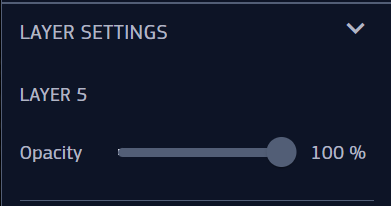
Settings panel serves also as an inspector for layers, displaying settings and detailed information.
Layer settings affect appearance and vary depending on the dataset type categories, data types and data visualization :
Map :
WMS
Colored Tiles
Opacity
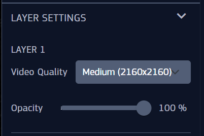
IMG
Colored Images
Opacity
Video Quality | Available only for DestinE Streamer Videos, can be Medium or High
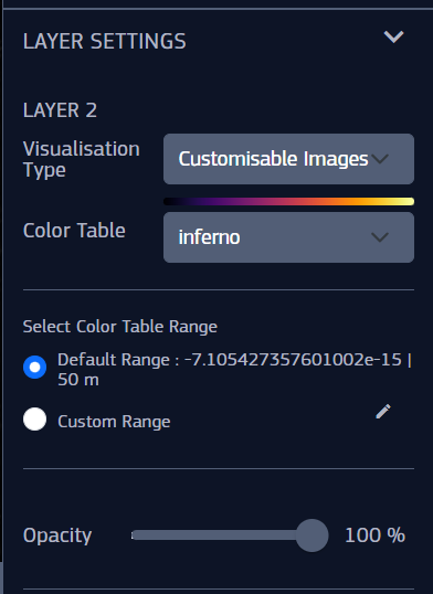
GRD
Customizable Images
Visualization Type | To switch between Customizable Images and Histograms
Color table
Color Table Range | Default or Custom. This setting is described below this list
Opacity
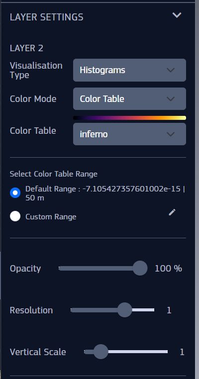
Histograms
Visualization Type | To switch between Customizable Images and Histograms
Color Mode
Color Table or Color if selected Uniform Color
Color Table Range | Default or Custom. This setting is described below this list
Opacity
Resolution
Vertical Scale
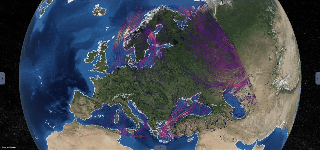
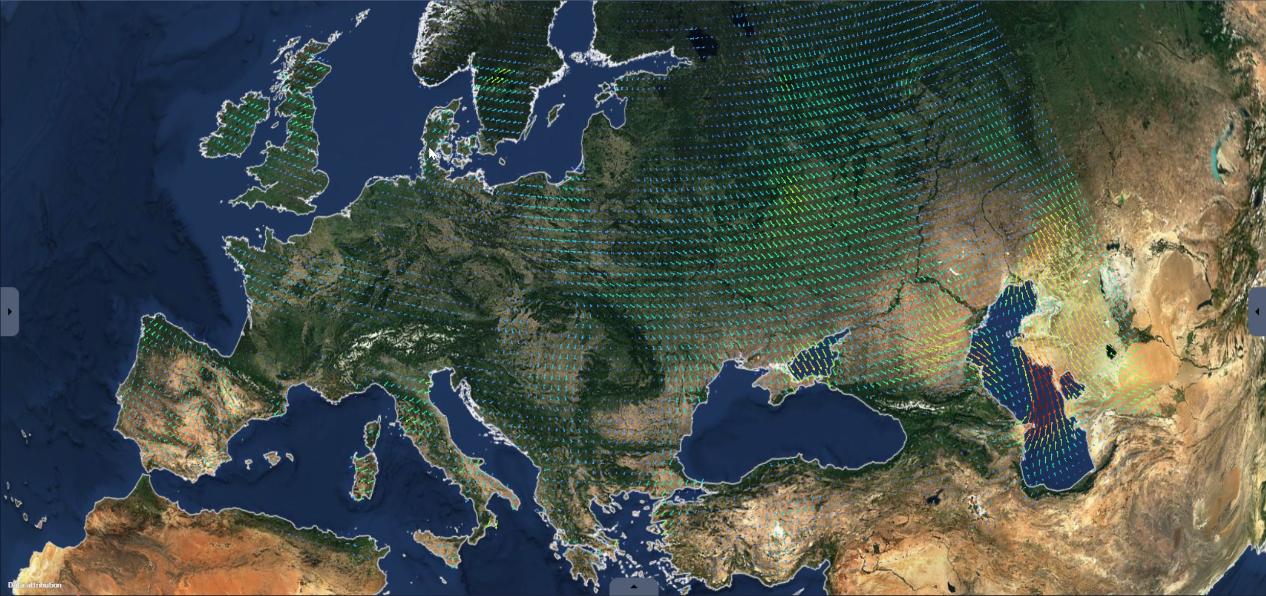
Flow :
VEC
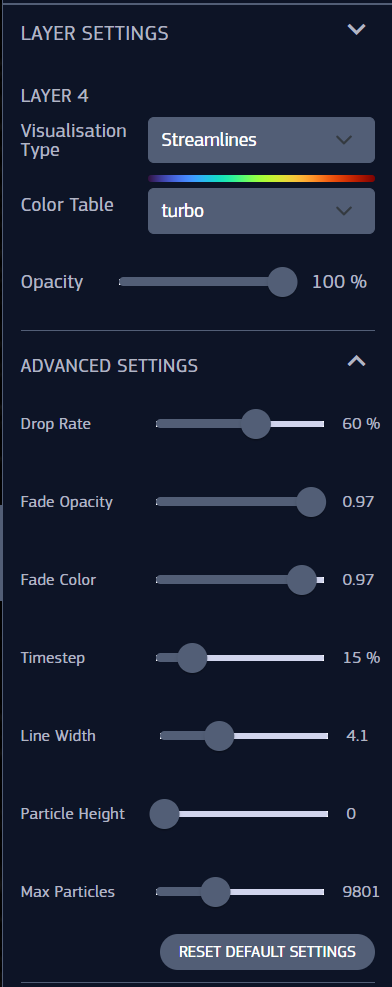
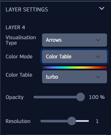
Streamlines
Visualization Type | To switch between Streamlines and Arrows
Color table
Opacity
Advanced Settings :
Drop Rate | The frequency of lines fading out
Fade Opacity | How rapidly the line trails fade out
Fade Color
Timestep | This influences the movement speed
Line Width
Particle Height | The elevation of the streams from the surface
Max Particles
Arrows
Visualization Type | To switch between Streamlines and Arrows
Color Mode
Color Table or Color if selected Uniform Color
Opacity
Resolution
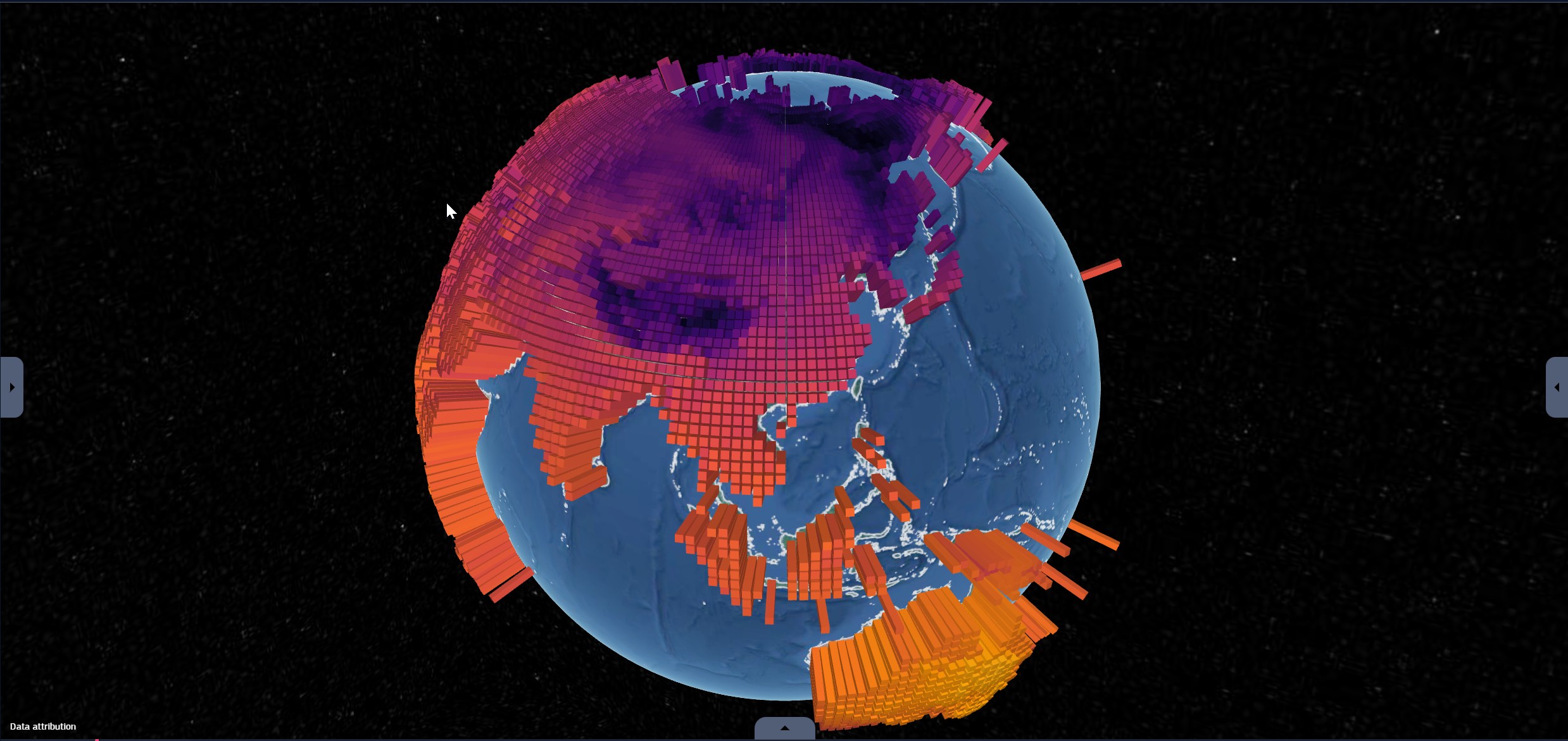
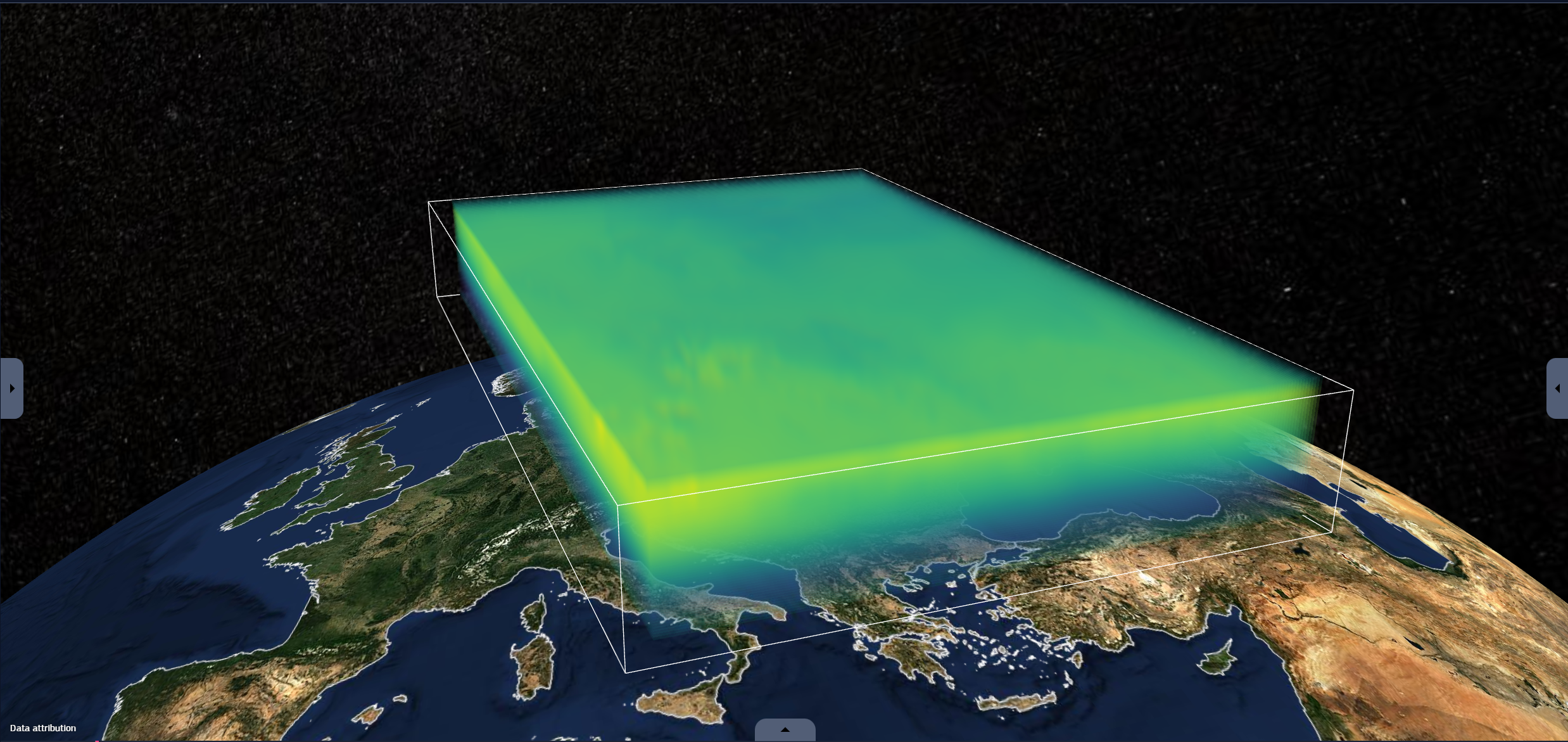
Volumetric :
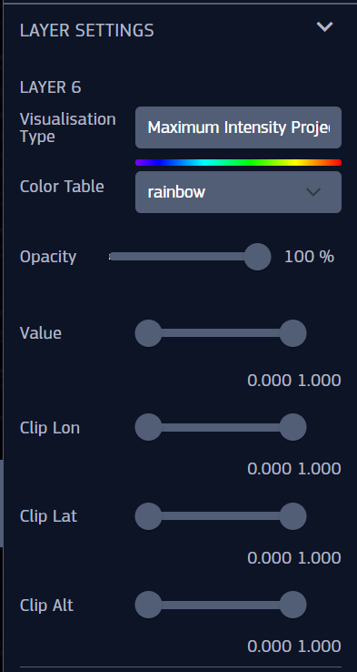
VOL
Maximum Intensity Projection, Direct, Isosurface | Same settings for all volumes
Visualization Type | To switch between Maximum Intensity Projection, Direct, Isosurface volumes
Color table
Opacity
Value | To change the range of the data values
Clip Lon
Clip Lat
Clip Alt
Color Table Range purpose : Normally numeric data is visualised with a color table that maps values to color based on min and max values.
To ensure meaningful comparisons between different data using the same color table, these min and max values must be consistent across datasets.
If they differ, these parameters can be adjusted to align the color mapping.
Fig. 2.26 Map settings for WMS - Colored tiles and IMG - Colored images (image only)
A brief overview of the graphic settings with their description :
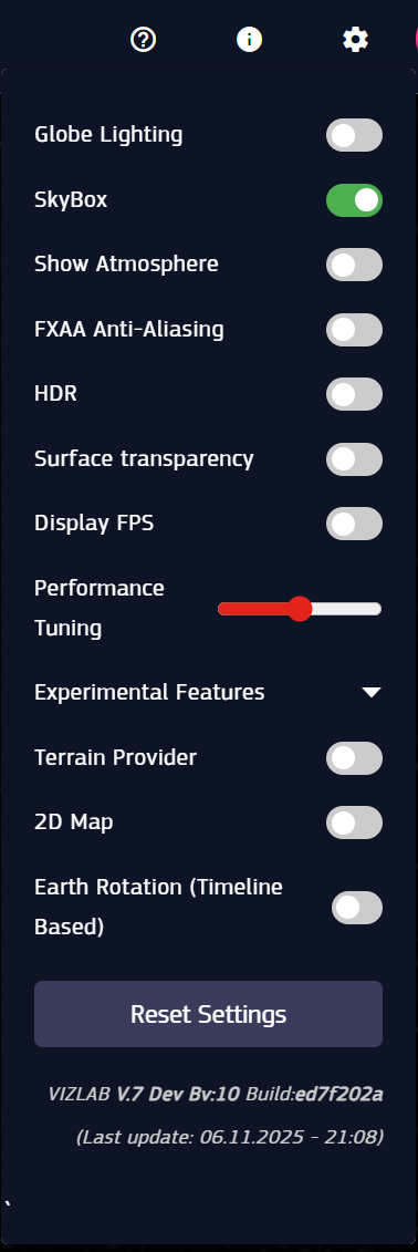
Globe Lighting - toggles the globe lighting display
Skybox - toggles the skybox display
Show Atmposphere - toggles the atmosphere display
FXAA anti-aliasing
HDR
Surface Transparency
Display FPS - toggles the display of the Frame Per Second (FPS) count
Performance tuning - this slider can increase or decrease the rendering resolution
Terrain Provider: Enables 3D elevation data on the globe, allowing you to see mountains and topography instead of a smooth sphere.
2D Map: Switches the viewer from a 3D globe to a flat 2D map projection (Mercator), useful for traditional cartographic analysis.
Earth Rotation (Timeline based): Automatically rotates the Earth model in sync with the timeline to simulate the day/night cycle based on the selected data time.
Reset settings - to set every other setting back to default
Performance Tip: If the application feels slow or frames-per-second (FPS) drop, try disabling these experimental features or adjusting the Performance tuning slider.